UI Components
The extension contains various UI components which are can be reused if case the distributors wants to modify the UI look and feel. Following are the details of these reusable components:
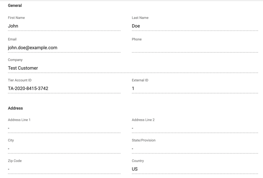
AccountInfo
This component is used to show the details of the Tier Account of the customer containing following information:
- Firstname
- Lastname
- Phone
- Company Name
- Tier Account ID
- External ID
- Address Line 1
- Address Line 2
- City
- State/Provision
- Zip Code
- Country
Example:
Properties
account
Pass the tier account details from connect to this component to render the property values.
Adding programmatically:
...
self.control_panel.add_component(
    AccountInfo(account=account),
)
...
ActiveSubscriptionOptions
This component can be used to show different options for any action subscriptions
like Actions, Download Links and Document Links
Example:
Properties
subscription_id
Subscription ID for which you want to show the options.
product_id
Product ID to which the subscription belongs to.
actions
List of subscription action objects available for the product from connect platform.
download_links
List of download link objects available for the product from connect platform.
document_links
List of document link objects available for the product from connect platform.
extend_height_to_page_end
Set as True if you want to extend the visibility of the component till the end of the page.
Events
action_click
Event will be raised when an action is clicked by the user.
Event Properties: 1. action_id: ID of the action which is triggered. 2. product_id: Product ID for which action has been called. 3. subscription_id: Subscription ID for which action has been called.
HaltedSubscriptionTemplate
HaltedSubscriptionTemplate can be used for terminated or suspended subscriptions.
Example:

Properties
subscription_status
Pass the status of the subscription as string.
Mandatory: Yes
Default: null
show_back_button
Specify True if you want to show the back button else False
Mandatory: No
Default: False
terminated_msg
Message to be shown in case the subscription is in terminated status.
Mandatory: No
Default: Sorry, this service has been terminated. Go to your account to manage your subscriptions.
suspended_msg
Message to be shown in case the subscription is in suspended status.
Mandatory: No
Default: Sorry, this service is unavailable at the moment.
extend_height_to_page_end
Set as True if you want to extend the visibility of the component till the end of the page.
Mandatory: No
Default: False
ItemList
This component is used to show the list of items available for a subscription.
Example:

Properties
subscription_items
Pass on the list of items from subscription from connect.
Mandatory: Yes
Default: null
header
Header string to placed on top of item table.
Mandatory: No
Default: Items
ProductCard
ProductCard component provides a small overview of the product along with a capability to show more details about the product based on event.
Example:

Properties
product
Pass on the product object from connect API.
Mandatory: Yes
Default: null
Events
show_detail
Click event on show short details link on the product card.
Event Properties: 1. product: Product for which show detail event has been generated.
ProductDetail
ProductDetail component shows details about the product along with icon, description, name and provider of the product.
Example:

Properties
product
Pass on the product object from connect API.
Mandatory: Yes
Default: null
Events
show_details
Click event on show short details link on the product card.
Event Properties: 1. product: Product object for which the details need to be shown.
ProductMenuItem
This component is used as single entry for the product list menu for specific product. It shows icon, name and provider.
Example:
Properties
product
Pass on the product object from connect API.
Mandatory: Yes
Default: null
Events
show_detail
On click event on the menu item to show details of the product.
Event Properties: 1. product: Product object for which detail need to be shown.
ProductListMenu
This component is used as menu containing list of ProductMenuItem belonging to each product.
Example:
Properties
products
List of product objects from connect API.
Mandatory: Yes
Default: null
Events
show_details
Show details of the product for which the event has been triggered.
Event Properties: 1. product: Product object for which the event has been triggered.
StatusProgressBar
This component is used for subscriptions in transitional status to show the progress bar for the transition.
Example:

Properties
subscription_status
Put status of the subscription.
Mandatory: Yes
Default: null
SubscriptionList
This component can be used to present list of subscriptions available for a product.
Example:
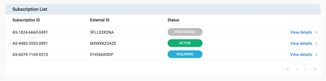
Properties
subscriptions
List of subscription objects from connect.
Mandatory: Yes
Default: null
Events
show_subscription_detail
This event will be triggered when the use clicks on the show detail link.
Event Properties: 1. subscription: Subscription object for which show details has been requested.
SubscriptionProperties
SubscriptionProperties component is used to show details of the subscriptions object in normalized manner. This component is very useful during development process.
Example:
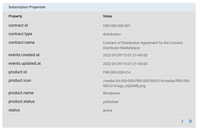
Properties
subscription
Pass on the subscription object from connect whose properties need to be shown.
Mandatory: Yes
Default: null
SubscriptionShort
This component is for show short details about the subscriptions containing following properties:
- Product ID
- Subscription ID
- External ID
- Subscription Status
Example:
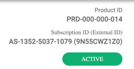
Properties
subscription
Pass on the subscription object from connect whose properties need to be shown.
Mandatory: No
Default: null
product_id
Product ID for which the subscription belongs to.
Mandatory: Yes
Default: null
align
Possible values are left or right. This indicates the alignment of the elements included on component.
Mandatory: No
Default: right